 |
Grab the badge if you want it for posting on
your own blog! |
Welcome to all those who decided to do a read-along with Batty. Welcome to those who are just stopping by the blog to hear about The Archived. Today’s post is entirely spoiler free, as we are just chatting about the outside of the book! Want to join in the fun?
Check out our…
Now, let’s talk Cover Appeal!
As always, Maria's posts are in purple and mine (Kathy) are in blue! Check out Maria's Melange for more science fiction fun.
Since I've already read The Archived, we decided that I would only respond to Maria's thoughts because we wanted to keep this SPOILER FREE!
Spine:
 Maria: I’m going to start with the spine. In some bookstores, The Archived may not end up facing out. Would that spine design be enough to pull me in? Between the intriguing title (I admit it, I love books… and the word “archive” sounds fascinating) and the parchment-like quality of the letters themselves, it would absolutely cause me to at least yank the book off the shelf to learn more. The spine seems designed to appeal to a bibliophile. I am curious about where it might be shelved in a larger bookstore, because that would impact who would even get to see the spine!
Kathy: I love the spine. Like you, I’m a book lover and I’ve been known to buy books because they have pretty spines! The faded look of the font and the deep, dark blue would have pulled me over. And once I touched it?? That suede-like feel would have me rushing to the cashier. Did you notice the leaves on the spine??? Also, I bet in our Barnes and Noble it would just be in the teen section alphabetically. I will pop over there later and see if I can snap a picture. If I find it, I’ll post the pic on Tumblr!
Front:

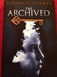
Maria: Once that book is in my hands, the front cover would absolutely lure me in. The face in the smoke billowing out from a golden key looks so intent. Honestly, what appeals to me most about that face is that it is clearly female and yet is not “posing” for me. She’s gazing into the distance, with a clear purpose in her eyes. So often the women on covers look like they are overly aware of the people looking at them. They pose to be “alluring”. This young woman breaks that mold, and I like it.
Kathy: Agreed! She looks intent and focused. She also looks a little sad to me. And also young. Despite the dark color to the cover, I started to wonder if this was MG or YA based on past experience. At this point, I still haven't’ read the back!
Maria: One question I have about this cover, though, is will it draw in boys? I think with the popularity of Hunger Games, boys are less likely to just ignore books that seem to be mostly about a girl. I think the color scheme and the lack of any “frills” on this cover would also make boys feel comfortable taking it off the shelf. What do you think?
Kathy: I agree with this. Especially since it was brought to my attention by one of the male teachers. Also, lately boys have pretty much been checking out anything from our library. They know I’m not judging. The City of Bones series is popular right now, despite the shirtless boy on that first cover. I think the less I (or other adults) act as if it means something, the more students will pick up whatever reading material they are interested in - despite its cover.
Maria: The background of blue and black really makes the golden key and face stand out. I’m curious about the walls behind her. Are they brick? Is she in an alley? Or does the glint on those blocks behind her mean that material is something else?
Kathy: It looks like brick to me with some light glowing down, just not everywhere. I also think the key looks important since it’s at the top and it’s sending the smoke down that leads to the girl’s head. I have to tread lightly here, though, based on what I can remember about the story.
Maria: I’m also a fan of the current trend toward velvety type texture on the book jacket.
Kathy: I mentioned this above! I love this suede-y velvety infinitely touchable cover. I’m sad that students won’t get to experience it because we cover the books with plastic before putting them out. Neither will the people who have the e-book. There’s something about this that makes the book holdable. I’m inclined to carry it around. Which will hopefully spark conversations about it... It also makes the book appear more literary? important? ancient? I think deckle-edged paper would have been another perfect touch.
Back:

Maria: Did you spot those gargoyles hunkered down on the top of the building? Is that a weather vane? Gargoyles are awesome. Sometimes they are part of a rain spout system, but traditionally they protect against evil. (Did you watch the cartoon series as a kid?) These two look slightly bored.
Kathy: I have never heard of a cartoon series called Gargoyles! Was it good? When was it on? The rest of this comment has been REDACTED. LAUGH! Now I’m extra intrigued!
Maria: The rest of the building seems creepy. Are the top windows boarded up, or is that just the reflection? The clouds above the building make it look like a storm is coming. All of these elements, combined with the color scheme, definitely give The Archived a haunted and creepy feel.
Kathy:I think the windows are just a reflection, though it does appear that all the windows have been shuttered from the inside. Add the crumbling paint and yes, it does look haunted! Is this why she needs the old-fashioned key? The building looks impossibly tall and I picture it on a hill somewhere sorta staring down at all who pass by. Huh, on closer look, those windows on the second floor do look painted over or boarded up at least on the bottom half!
Inside Cover Copy:

Maria: So the outside of the cover would definitely get me to pull it off the shelf and give it a chance, but the real test (for me) is the plot blurb inside the front cover.
Kathy: “Imagine a place where the dead rest on shelves like books.” I can imagine it! I like that the first paragraph sets up the entire book in less than 35 words! And again, she sounds like a young kid with a tough job. This will draw in the 7th and 8th graders.
Maria: I’m sold. Between my love of books and my love of history, it feels like this storyline is calling my name. Can you imagine walking up to the History of Joan of Arc, or Elizabeth I and getting the full truth? Now imagine that someone is purposefully destroying that information…. Yes, I know that The Archived is set in another world and my favorite faces from history won’t be in this tale, but I’m ready to hear about Mac’s world. Let’s get started!
Kathy: This appeals to my book lover and my librarian sensibilities! It’s beautiful on the outside and hints at beauty on the inside. Even without the jacket the book is appealing with it’s dark blue cover and silver writing. The end flaps have a nice silver fleur de lis on a black background. Did you notice that the author’s name matches the color of the key? And the title is actually a light blue instead of silver - same as the girl’s face? A lot of thought went into this book design. Let’s “uncover” how well it matches the story!
Pick up a copy of The Archived (Amazon Kindle Edition
| Amazon
| Shop Indie) and read along with us.
Next Saturday, March 1st, we'll discuss pages 1 - 110.

When I think of Rosa Parks, the words that immediately come to mind are “self-respect,” “courage” and “dedication.” Her self-respect is clearly expressed in her choice to walk to work on many days, rather than accept the demeaning rules of the Montgomery bus company. Her decision to keep her seat on the bus, on December 1, 1955, although it would mean going to jail, where history had shown that she could be beaten or even killed, was an extremely courageous act. Her years of work with the NAACP and the Montgomery Voters League, preceding the bus incident, were early signs of her dedication to the cause of freedom for black people.
For me, Rosa Parks is one of a multitude of African and African American people who, beginning with the kidnappings in Africa, have shown courage, self-respect and dedication in the cause of freedom.


