Batty About Books presents
Welcome to the beginning of our discussion of Not A Drop to Drink! This week we look at the Cover. You still have time to grab the book before we dive into the reading!
Week 1 pgs 1 - 95
Week 2 pgs 96 - 195
Week 3 pgs 196 - end
We hope you join us!
Here’s what I (@thebrainlair) thought of the cover. Don’t forget to stop by Maria’s Melange to get her side of the story! (@mselke01)
Cover Appeal
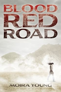
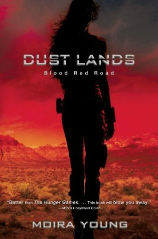
The dried out hills and dusty-looking sky remind me of the covers of Blood Red Road by Moira Young. The original hardcover had a girl struggling against the wind/dust and the new one has the dried out brush and mountains. I don’t know why, but that’s what came to mind.

I was actually attracted more to the title than the cover. I don’t really like the cover, except from a design aspect (just finished my first year as yearbook adviser, now I’m scouting for ideas!) The cover look computer designed. The water does not look appealing and the scale seems off. Maybe this is done intentionally?
Maria: Hmm… I got a different feeling from the cover. I liked the creepy color scheme, because it made me feel like what little water there is in this world is not safe. The small pond also looks like it’s drying out to me. I also can’t really see tiny details, since I don’t have a physical copy of the book to examine.
The lone girl, with the rifle slung on her back, on top of the roof looks like she’s facing away from us - so the water is in the backyard. The house looks dilapidated. Does this mean the water is their only treasure? Is she alone?
Maria: I love the solitary - isolated feeling this cover shows. It fits well with the blurb on the back about how the story is like “Laura Ingalls Wilder meets Cormac McCarthy”... creepy!
The house is also very isolated. Doesn't appear to be another house as far as the eye can see. This also reminds me of Blood Red Road.
I love the quote on the inside flap:
“She makes sure anyone who comes near the pond leaves thirsty or doesn't leave at all.”
Apart from the cover, with its cool font design, and the title, this is what really makes me want to dive in!
My biggest worry about reading this book is that I’ll start stockpiling my house with water and supplies. Time to prepare for our own zombie apocalypse!
I’m ready to read! Look for quotes from the first part to be posted throughout the week with our discussion being posted Saturday, April 5, 2014. Fair warning - that’s the first Saturday of Spring Break! Anything can happen!
Don’t forget to check out our


No comments:
Post a Comment
Thanks for chatting! I love comments and look forward to reading yours! I may not reply right away, but I am listening! Keep reading and don't forget to be awesome!